Packaging Design Nong Li Beer Packaging by China Resources Snow Breweries
Packaging Design Xijiu Matured Liquor Packaging by Chengdu Times Fashion Art Design Co., Ltd
Fine Arts and Art Installation Design Mystical Serpent Light Art Installation by Weijie Yang
Computer Graphics, 3D Modeling, Texturing, and Rendering Design 3D Cakes CGI Food by Andre Caputo
Packaging Design Moutai Dream Red Wine Packaging by Meijie He
Social Design FOODres Food Waste 3D Printing by Yiqing Wang, Biru Cao

Design of the Day A' Design Award & Competition is pleased to present you with the Design of the Day, an excellent example of good design that makes a positive change. View the Design of the Day showcase to see previously featured good design works today.

Design Team of the Day A' Design Award & Competition is pleased to present you with the Design Team of the Day, an outstanding design team that makes the World a better place with their good designs. View the Design Team of the Day showcase to see previously featured design teams today.

Designer of the Day A' Design Award & Competition is pleased to present you with the Designer of the Day, an outstanding and extraordinary designer that advances society with their good design. View the Designer of the Day showcase to see previously featured designers today.
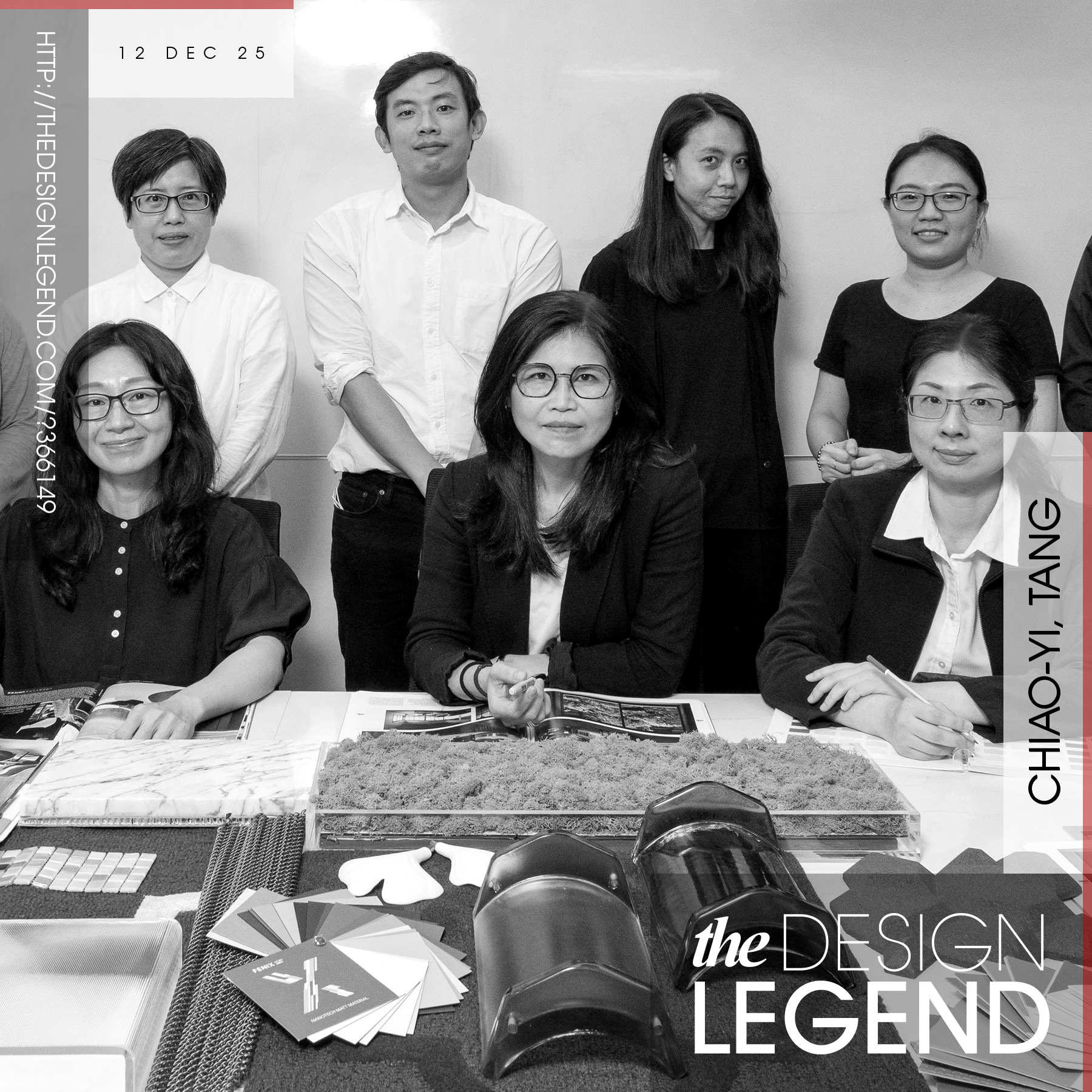
Design Legend of the Day A' Design Award & Competition is pleased to present you with the Design Legend of the Day, a true design legend that changes the world with their exceptional design work. View the Design Legend of the Day showcase to see previously featured design legends today.

Design Interview of the Day A' Design Award & Competition is pleased to present you with the Design Interview of the Day, an amazing interview about an excellent design work. View the Design Interview of the Day showcase to see previously featured design interviews today.
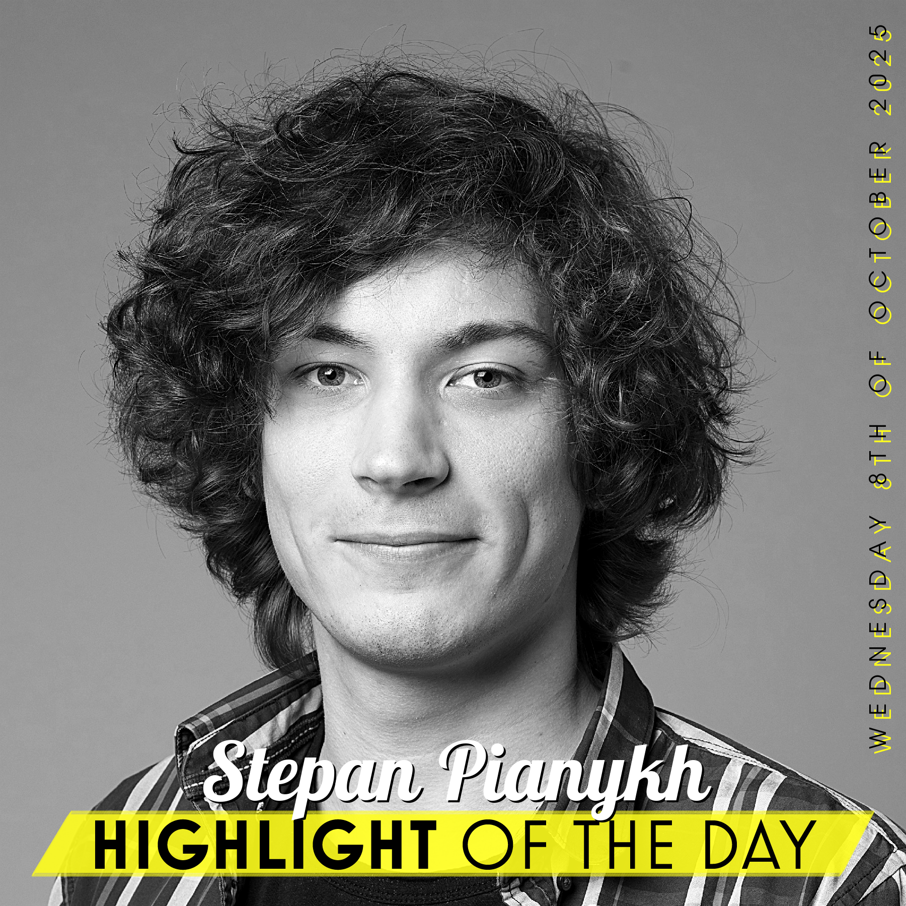
Designer Highlight of the Day A' Design Award & Competition is pleased to present you with the Designer Highlight of the Day, an excellent designer with outstanding design works. View the Design Highlight of the Day showcase to see previously featured designers today.
Fine Arts and Art Installation Design Life Science Code Monument by Takumi Takahashi
Interface, Interaction and User Experience Design Datalense Data Visualization by Yu Guo
Graphics, Illustration and Visual Communication Design Culture to Technology Identity Placard by Lei Wang
Cultural Heritage and Culture Industry Design Red Fort Center Visitor Orientation by SIDDHARTH BATHLA
Graphics, Illustration and Visual Communication Design B. League All-Star Game 2023 Op Art by SonyMusic Solutions inc.
Computer Graphics, 3D Modeling, Texturing, and Rendering Design Procedural Flowers Digital Illustration by You Zhang
Interface, Interaction and User Experience Design Cathay Pacific IFE In Flight Entertainment Experience by Deniz Kurtcepe
Social Design Aquacendo Bottle by Shanghai Grand Trade Co.,Ltd.
Performing Arts, Stage, Style and Scenery Design Hua Chenyu Mars Concert Sunrise Version Stage by Peng Guo
Packaging Design Indian Absinthe Heritage Liqueur by Dheeraj Bangur
Packaging Design Flora Gin by Ian Wallace
Performing Arts, Stage, Style and Scenery Design 2021 Hua Chenyu Mars Concert Stage by Peng Guo
Mobile Technologies, Applications and Software Design MyJCB Credit Card App by FOURDIGIT Inc.
Mobile Technologies, Applications and Software Design Sharge Private EV Charging Pile Sharing APP by Fang Xu
Packaging Design Guijiu 20 Baijiu Packaging by Meijie He
Packaging Design Kweichow Moutai Baijiu Packaging by Meijie He
Packaging Design Yanghe Naked Bottle Liquor Baijiu Packaging by Meijie He
Packaging Design Moutai Shengyue Flying Fairy Packaging by Ying Song Brand Design Co., Ltd
Advertising, Marketing and Communication Design HYZY World Youth Activity Center Corporate Identity by ECUST | Hao SHAN
Graphics, Illustration and Visual Communication Design Guangzhou Academy of Fine Arts Exhibition Visual Identity by CHUNSHENG SHI
Computer Graphics, 3D Modeling, Texturing, and Rendering Design 3D Wafers CGI Food by Andre Caputo
Interface, Interaction and User Experience Design Chery E02 Hmi Design by CHERY
Fine Arts and Art Installation Design Spiral Bloom Public Art by Kuo-Hsiang Kuo
Interface, Interaction and User Experience Design Journeylink Multi Vehicle Car Infotainment by Yan Zeng
Graphics, Illustration and Visual Communication Design Aisling Sans Typeface by Paul Robb
Packaging Design Zaku Naguwashi Japanese Sake by Yasushi Uemura
Mobile Technologies, Applications and Software Design Conexion Mobile Application by Ziwei Song
Packaging Design Shahi Gulab Liqueur Packaging by Dheeraj Bangur
Packaging Design 128 Bpm Gin Packaging by Ximena Ureta
Cultural Heritage and Culture Industry Design Bishan Bookstore by Zhao Yunhai
